Hashtag

Explicit novel Icebreaker is under fire for its ‘misleading’ cover. A book designer explains – and reveals how covers work

  • Written by Jenny Grigg, Senior Lecturer, Design and Social Context, RMIT University
Explicit novel Icebreaker is under fire for its ‘misleading’ cover. A book designer explains – and reveals how covers work

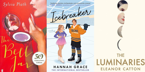
Primary school students have been reading TikTok sensation Icebreaker, an enemies-to-lovers romance about a figure skater and an ice hockey player. The cartoon cover features a ponytailed girl (who looks to be in her tweens) in a sparkly purple costume, smiling up at a much taller boy holding a hockey stick.

But the content is “very, very explicit”, an unsuspecting parent, who gave the book to her ten-year-old stepdaughter, told the Age.

It’s unsurprising the book has been mistaken as suitable for younger readers. While there is a small-print warning about explicit material on the back cover, it’s easy to miss. And the cartoon image – particularly its sparkly costume – does suggest an under-18s audience. The publisher’s decision to commission a cartoon-style illustration for a sexually explicit novel is interesting. To achieve a more mature result, the publisher could have commissioned, for example, a designer who works with photography or typography. There are lots of choices an illustrator makes in representing a book’s characters on its cover, including outfits and body size. Many of those choices are dictated by others: the publisher and author often have a say in these details, and more recently, so can AI. The depiction of the characters on another, similar ice-hockey romance, Collide, which also has an illustrated cover, is more clearly intended to appeal to university-aged readers. This is reflected in the clothing choices, finer and more chiselled use of line and the characters’ confident postures, which are all more age-appropriate to the text. Cartoon romance covers are reportedly a trend that, according to Paste magazine, “deliberately or otherwise, also evoke YA [young adult] fiction”. The trend is also influenced by BookTok, which is young-leaning. Apparently, romance cartoon covers can be a way to take advantage of that audience crossover, despite being “doomed to lead to multiple instances of reader miscommunication”. How do book covers communicate with an audience? How do designers and publishers make their decisions? And how can it go wrong like this? How do book designers create covers? I’ve been a book designer since the 1990s, working with some of Australia’s and the United Kingdom’s leading publishers. These days, I design book covers for Giramondo Publishing. A cover designer’s role is to interpret a book visually, reflecting what the author and publisher have achieved in the text. That role is primarily determined by a publisher’s agenda. Sometimes the end result is a reflection of what the book is about, though often it’s not. In commercial publishing, the core of the task is to interpret what the market has been preconditioned to want. A cover designer will work to a set of decisions made by a team of people, who are concerned with taking the book to as many people as possible. The more commercial the book, the more a designer is required to adapt their design skills to accord with current marketing trends. With more literary titles, a designer’s imagination can come into play, in response to the text and the author’s creative intentions. For world-renowned Australian author Gerald Murnane’s final book, Last Letter to a Reader, the notion of recursion – the act or process of returning, or running back – was key. Giramondo’s publishing director Ivor Indyk briefed me on this idea as a major theme of Murnane’s writing. With this very abstract concept as a starting point, I saw a way to use a sequence of book-shaped lines to reference Murnane’s written works and signify Murnane’s life as a writer. Sometimes, books are published in different formats for different readerships – the two different covers reflect these different aims. For example, Granta Books planned to publish both a hardcover and mass-market paperback version of Eleanor Catton’s The Luminaries. The brief for the 2013 first edition encouraged my creative interpretation of the novel but the mass-market paperback, published a year later, was very prescriptive. It specifically requested a background based on a blue chapel ceiling painted with gold stars, added to the existing hardcover design – which, by now, globally identified the Booker Prize winner. Updating classics: The Bell Jar A 50th-anniversary edition of Sylvia Plath’s The Bell Jar was controversial when it was released in 2013, with some calling its image of a woman applying lipstick in a mirror “laughably inappropriate for a work tracing a descent into near-suicidal depression”. Without knowing how this cover came together, the choices made to update it for a new readership are interesting to consider. Presumably a lot of care has been taken in the representation of the woman on the cover. It seems to represent Plath herself, and potential new readers of the book. It has a positive message in some ways: in the early 1960s, when it was published, issues such as mental health were less talked about than they are today. Maybe this cover is intended to speak to that, making the book relatable now. If this was the intention, the design treads a fine line well. It appears as a personification of Plath for new readers. Still, the original 1963 cover by Shirley Tucker (who wasn’t credited as the designer at the time) is much more engmatic. It’s also a design classic. Tucker, who often worked for Faber, was aware of Plath’s difficult life story through Faber’s connection to Ted Hughes. Tucker’s simple, effective design, which she describes as “a doodle that turned into a jacket”, responds abstractly to the issues Plath raises in her book, rather than market concerns. Shirley Tucker talks about designing the cover for The Bell Jar. Representing Lolita “Is it possible to illustrate scenes from Lolita without carrying its considerable baggage?” wondered a 2016 article when the first illustrated version of the book was published. Vladimir Nabokov’s novel about a paedophile’s destruction of a young girl, told from his unreliable perspective, has had so many different covers since it was first published in 1955, they’re now beginning to reference each other. Most of them are overtly sexual – and are sometimes paedophilic. I quite like the Penguin Modern Classics version (below, centre) first published in 2000. It’s such a static image, knowing in a way. Its staid composition and slightly sinister colour palette seem to say: you’ve seen all the sexual covers and this is not a sexual cover – we know that you know what this book is about. In any case, the painting selected to represent Lolita cleverly engages the imagination. If we consider the cover as a device that transitions readers into another world, and we consider sexual life to be private, we can see the premise of this design is its resistance to telling all. While I prefer abstract covers, they are very difficult to sell to commercial publishers, who tend to want the literal. They mostly want designers to illustrate something, not to set a proposition for the audience to interpret. Publishers want their readers to be drawn to pick their books from bookshop shelves (or online) – but they also want them to walk away with what they intended to buy. They are keen to avoid creating the unfortunate experience of the woman who bought Icebreaker for a ten-year-old. Authors: Jenny Grigg, Senior Lecturer, Design and Social Context, RMIT University

Read more https://theconversation.com/explicit-novel-icebreaker-is-under-fire-for-its-misleading-cover-a-book-designer-explains-and-reveals-how-covers-work-237315

Health & Wellness

How to Maintain Your Oral Health During Stressful Times

Hashtag.net.au - avatar Hashtag.net.au

Life can be a bit like an Australian outback road—full of twists, turns, and the occasional bump. During these hectic, stressful times, it’s all too easy to let your oral health fall by the wayside...

The impact of visual art on mental health and productivity

Hashtag.net.au - avatar Hashtag.net.au

In a world where stress and anxiety often take center stage, the presence of visual art in our daily environments offers a quiet yet profound counterbalance. Posters and paintings are not just decor...

Understanding the Environmental and Health Impacts of Waste Disposal: Essential Insights

Hashtag.net.au - avatar Hashtag.net.au

🌎♻️Explore the health & environmental impacts of waste disposal. Dive into essential insights💡for a sustainable future! #WasteManagement #Health🌿🌍 Waste disposal is an inevitable aspect of mode...

The Role of a Child Psychologist: Helping Kids Navigate Emotional Challenges

Hashtag.net.au - avatar Hashtag.net.au

Child psychologists play an important role in aiding children to overcome behavioral and emotional challenges. The experts will easily identify the developmental stage and emotional needs of the chi...

Tomorrow Business Growth