The government's coronavirus mobile app is a solid effort, but it could do even better
- Written by Omar Mubin, Senior Lecturer in human-centred computing & human-computer interaction, Western Sydney University
The Australian government has launched an app offering up-to-date advice and information on the COVID-19 pandemic.
The Coronavirus Australia app, available on the Apple App Store and Google Play, was released alongside a new WhatsApp messaging feature.
As this pandemic unfolds, the public’s ability to quickly access reliable information will be of paramount importance. Let’s take a look at whether this latest digital initiative hits the nail on the head.
Read more: 9 ways to talk to people who spread coronavirus myths
What are the features?
The app provides eight distinct features for people seeking information on COVID-19:
Symptom checker directs users to a diagnostic tool from the Department of Health, that gives advice based on a user’s situation.
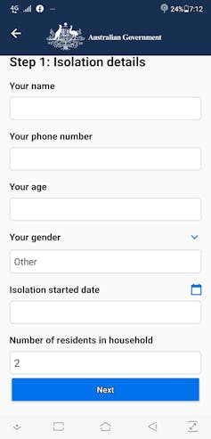
Register isolation is an optional feature that requests certain personal details from users in self-isolation, including access to their location, their name, phone number, age, gender, isolation start date and the number of residents in their household.
 The Coronavirus Australia web app was launched at the weekend, and has been downloaded more than 10,000 times from the Google App Store.
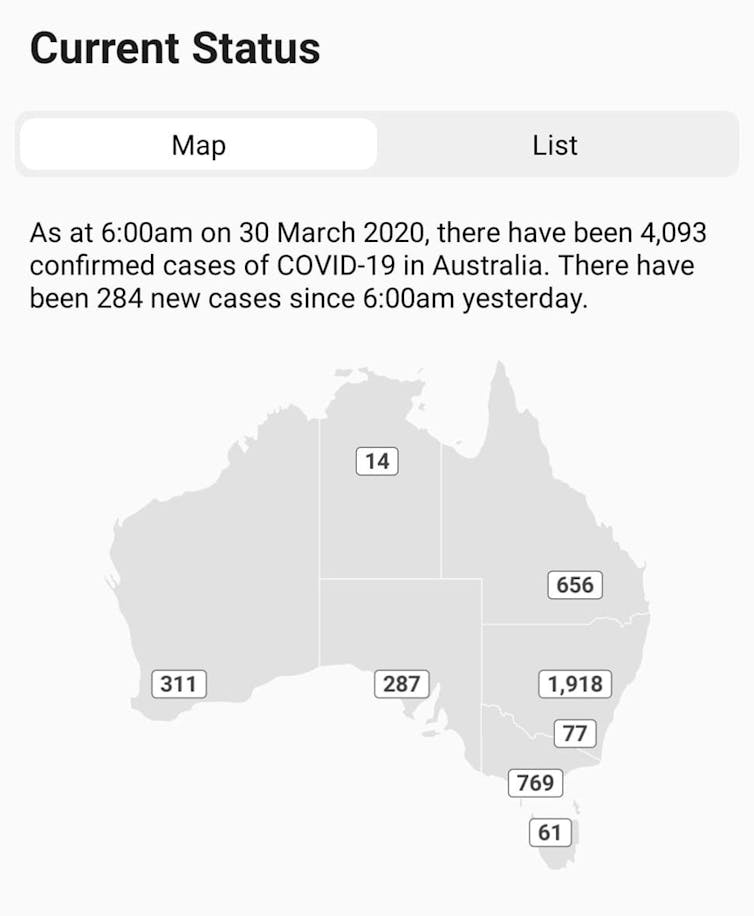
The current status feature provides a visual (map) and text-based breakdown of the number of confirmed cases per state.
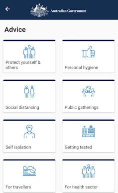
The advice section elaborates on several important topics related to COVID-19, including social distancing, travel, self-isolation, getting tested and accessing financial assistance.
The resources section offers information targeted at individuals and groups including employers, and industry bodies such as the airline industry, hotel industry, cruise industry and aged care organisations.
The news and media section displays relevant news articles and videos released by the government.
The contact section, accessible through the left-hand menu, directs users to helpline numbers.
Settings allows users to enable push-notifications and read the app’s privacy policy.
Missed opportunities
While the Coronavirus Australia app is certainly a great start, we’ve identified some features that could make it even more effective with future updates.
In terms of content, the app seems to miss an opportunity to provide positive reinforcement during a terrible crisis. For instance, as time progresses it could highlight improvements in the national effort to flatten the curve of the coronavirus.
Read more: How to flatten the curve of coronavirus, a mathematician explains
The app’s tone is neutral, but it could have used more persuasive language and prompts, especially in regards to self-isolation and social distancing measures – which continue to be at the forefront of national discussions. And crucial points such as state-specifc restrictions are currently hidden in the advice section. Important information should be emphasised.
Also, certain language in the app’s text, such as the term “pneumonia”, may not be widely recognised. These terms could be defined using Tooltips. This widget displays text descriptions when users hold their cursor or finger over an object on the screen.
The current status section provides a static visual map that repeats information in the written text. While this map is informative, it cannot be interacted with or zoomed into for more area-specific data.
 The Coronavirus Australia mobile app offers updated advice and information related to the pandemic, including a map showing cases by states and territories.
In terms of design, the app is mainly black and white. Using a range of colours and alerts could help categorise information, and draw the user’s attention to important aspects.
Another simple update would be to include the logos of all the state governments and departments that contributed to the app’s content. While the current federal government logo is enough to establish authenticity, research suggests having endorsements from additional bodies improves credibility.
The app doesn’t support languages other than English. This is significant as news reports suggest thousands of overseas visitors have been trapped in Australia as a result of COVID-19. These people will be as desperate for information as the rest of us.
More considerations
Rather than having all the necessary information available in the Coronavirus Australia app itself, many links redirect users to the government’s Department of Health website. For some, this may seem like the app is simply a landing page for the department’s website.
Also, while the logging of those who are isolating is an excellent feature, it relies on honest self-reporting. This can’t be guaranteed. If authorities wish to analyse or use the collected data to enforce social-isolation measures, then identification such as a drivers license or passport will be needed to prevent fake reporting.
 Data collected from the register isolation section would be more useful to authorities if users’ specific addresses were included, and user identity was verified.
Misleading reports could also be avoided by prompting users to enter the specific address they are self-isolating at (including details such as hotel name and room number), rather than simply using GPS location data as the app currently does.
In terms of potential advances in the app’s features, one option would involve using a user’s location to detect if they are away from home for longer than a specific advised time. The app could then send subtle prompts to remind the user to return to self-isolation.
A summary of the government’s latest restrictions, sorted by states and territories, would also be helpful, as would a section debunking common myths associated with COVID-19.
Read more: Explainer: what is contact tracing and how does it help limit the coronavirus spread?
Despite the small margins for improvement, the Coronavirus Australia app indicates the government has made an effort to provide quick and helpful information at a highly uncertain time. As this pandemic evolves, further incremental updates would certainly enhance its user experience.
Authors: Omar Mubin, Senior Lecturer in human-centred computing & human-computer interaction, Western Sydney University


